Building a successful online store means paying attention to every little detail. We’ve put together some thoughts on the most important pages for your ecommerce website, looking at what makes them work for shoppers. Think of it as a guide to making your online shop not just look good, but actually sell well. We’ll cover the main areas you need to get right, from the first click to the final purchase, to help you create an ecommerce website that people want to use.
Key Takeaways
- A good ecommerce website design focuses on making things easy for shoppers, combining good looks with smart functionality to turn visitors into buyers.
- Top online stores make it simple to find products, offer clear information, and have smooth checkout processes, especially on mobile devices.
- Thinking about the whole customer journey, from the homepage to the final thank you, helps build trust and encourages people to come back.
Homepage
Okay, so the homepage. It’s kind of like the front door to your online shop, right? It needs to be welcoming and give people a good first impression. We want visitors to land here and immediately get a feel for what we’re selling and why they should stick around. It’s the first thing people see, so it has to count.
Think about it like this: you walk into a physical store. If it’s messy and confusing, you’re probably not going to stay long. The same goes for your website. We need to make it clear and easy to understand what we do. Showing off our best products or what’s new right away is a good move. Maybe a cool banner with a special offer or a highlight of a popular item. We also want to make it super simple for people to start looking around.
Here are a few things we think make a homepage work well:
- Clear Value Proposition: What do we sell and why is it cool? This needs to be obvious within seconds.
- Visual Appeal: Good photos or graphics that match our brand. No blurry stuff!
- Easy Navigation: Links to other important parts of the site should be easy to find.
- Call to Action: What do we want people to do next? Shop now? Learn more? Sign up?
We’ve seen some sites that just throw everything at you at once, and it’s overwhelming. A cleaner, more focused homepage usually does a better job of guiding people where they need to go without making them feel lost. It’s all about making that initial connection.
We also like to see things like customer testimonials or a little bit about our story right up front. It helps build trust. And don’t forget about making sure it looks good on phones and tablets, because, let’s be real, that’s how most people shop these days.
Product Pages
Alright, let’s talk about product pages. These are, like, the main event, right? It’s where someone decides if they’re actually going to buy something from us or not. So, we gotta make them count.
First off, the pictures. We need more than just one little thumbnail. Show the product from different angles, maybe a video if it makes sense. Think about close-ups too, so people can see the details. If it’s something like clothing, show it on a model. For furniture, show it in a room setting. Basically, help people imagine having it.
Then there’s the description. This isn’t just a list of specs. We need to tell a story here. What problem does this thing solve? How will it make someone’s life better? Use clear language, no fancy jargon. We want people to understand exactly what they’re getting and why they need it. A good product page makes the decision to buy feel easy.
Don’t forget about reviews. Seriously, people trust other shoppers way more than they trust us. So, make sure reviews are front and center. Let people see what others are saying, good and bad. It builds trust, you know?
Here’s a quick rundown of what we think makes a solid product page:
- Great photos/videos: Show the product clearly from all sides.
- Clear, compelling description: Explain the benefits, not just features.
- Customer reviews: Let social proof do the heavy lifting.
- Easy-to-find pricing and ‘Add to Cart’ button: No hunting required.
- Shipping and return info: Be upfront about the details.
We also found that having comparison tables can be super helpful, especially if we sell similar items. It lets folks see the differences side-by-side without getting overwhelmed. It’s all about making it simple for them to choose.
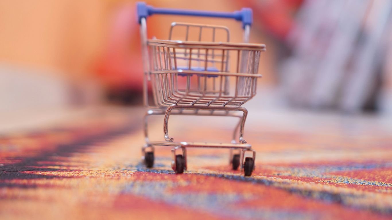
Shopping Cart
Okay, let’s talk about the shopping cart. This is where all the magic happens after someone decides they want your stuff. It’s not just a place to dump items; it’s a really important step in the whole buying journey. We want this to be super easy for people, right? Nobody likes a confusing cart.
The best shopping carts let customers see what they’ve added at a glance, without making them leave the page they’re on. Think of it like a little pop-up or a sidebar that shows up when they add something. This way, they can quickly check quantities, maybe remove something if they changed their mind, or just feel good about what’s in there before they move on to paying. It’s all about making things feel smooth and not like a chore.
Here’s what we usually look for in a good cart:
- Clear Item Display: Show the product image, name, quantity, and price for each item. No guessing games!
- Easy Quantity Adjustment: Let people easily change the number of items or remove them completely.
- Subtotal Visibility: Always show the running total so they know how much they’re spending.
- Continue Shopping Option: Make it obvious how to go back and add more items.
We’ve seen some carts that are just a pain to use, and honestly, we’ve probably all abandoned a cart because of it. It’s frustrating when you can’t easily edit things or see the total cost. A clunky cart can really kill the vibe and make people think twice about buying from you. It’s a big reason why people might just leave and not come back, which is the last thing we want. Making this part simple is key to reducing cart abandonment.
We really try to make sure our shopping cart feels like a helpful assistant, not a roadblock. It should confirm their choices and make them feel confident about moving forward to the checkout.
Checkout Process
Okay, so we’ve picked out our goodies and they’re sitting pretty in the cart. Now comes the part where we actually pay for them – the checkout process. This is where a lot of online stores can trip up, and honestly, it’s a shame when it happens. We’ve all been there, right? You’re ready to buy, but then the checkout asks for your life story, or it takes you through a dozen pages. It’s enough to make you just close the tab and forget about it.
We want this part to be as smooth as possible for our customers. Think of it like this: you’re at the finish line, and we just need to make sure you can cross it without any hurdles. A complicated checkout is a big reason why people abandon their carts. So, we try to keep it simple.
Here’s what we focus on:
- Fewer Steps: We aim to reduce the number of pages or clicks needed to complete a purchase. Sometimes, a single page where you can see everything and fill in your details works best. Other times, a clear progress bar showing you exactly where you are in the process helps a lot.
- Clear Information: We make sure all the necessary fields are obvious and that you know exactly what information we need. No hidden surprises here.
- Guest Checkout Option: Not everyone wants to create an account right away. Offering a guest checkout means people can buy what they want without the extra step of signing up.
- Mobile Friendly: Most people shop on their phones these days, so the checkout needs to work perfectly on a small screen. Everything should be easy to tap and read.
We’ve learned that keeping the checkout process straightforward and transparent really makes a difference. It’s not just about getting the sale; it’s about making sure the customer has a good experience right up to the very end. If it’s easy to pay, they’re more likely to come back.
We also make sure our branding stays consistent throughout this whole process. You should still feel like you’re on our site, with the same look and feel. It builds trust, and that’s super important when you’re asking for payment details.
Navigation Menu
Okay, let’s talk about the navigation menu. This is basically the map for your online store, and if it’s confusing, people will get lost and probably leave. We want to make it super clear where everything is. Think about using simple, familiar words for your menu items – stuff like ‘Home,’ ‘Shop,’ ‘About Us,’ and ‘Contact.’ If you have a ton of products, a mega menu can be a lifesaver. It lets you show off a bunch of categories all at once, so shoppers can see their options without clicking around endlessly.
We’ve found that a well-organized menu usually includes:
- A clear link to the homepage.
- Categories for your main product types.
- Links to important pages like ‘About Us’ and ‘Contact.’
- Sometimes, a link to a blog or special offers section.
The goal is to make it effortless for someone to find what they’re looking for. It’s not just about listing pages; it’s about guiding people smoothly through your site. We don’t want any "Where did I just go?" moments. A good menu feels intuitive, almost like you know where to click before you even think about it. It’s a subtle but really important part of the whole shopping experience.
Search Bar
Okay, let’s talk about the search bar. This little guy is super important, maybe even more than we give it credit for. When someone knows what they want, they don’t want to mess around clicking through categories. They want to type it in and find it, like, yesterday.
We’ve found that a well-placed and smart search bar can seriously cut down on frustration and boost sales. Think about it: if you can’t find something easily, you’re probably just going to leave, right? We’ve seen sites that put their search bar right at the top, usually center or top-right, and it makes a huge difference. It’s just there, ready to go.
Here’s what makes a search bar really shine:
- Autocomplete Suggestions: As we type, suggestions pop up. This is great because it helps people spell things right and also shows them related items they might not have thought of. Some sites even show little pictures next to the suggestions, which is pretty neat.
- Filtering and Sorting: Once you get results, being able to narrow them down is key. Think filters for price, color, size, or whatever makes sense for the products. This stops people from getting overwhelmed.
- Clear Results: The results page itself needs to be easy to read. Show good pictures, clear names, and prices. If it’s a mess, people will bounce.
We’ve noticed that when a search bar has features like auto-complete and clear filtering options, customers tend to stick around longer and find what they’re looking for much faster. It’s all about making that discovery process as smooth as possible.
Honestly, it’s not just about having a search box; it’s about making that search experience helpful and quick. If you’ve got a lot of products, this is non-negotiable.
Footer
Okay, so we’ve talked about all the flashy bits of an ecommerce site, but let’s not forget about the footer. It might seem like an afterthought, but it’s actually a really important spot for us. Think of it as the place where all the practical stuff lives, the bits and bobs that people need to find but don’t necessarily want to see all the time.
We always make sure our footer has the essentials. This usually includes links to our contact page, an ‘About Us’ section, and maybe even a link to our FAQ. It’s also where we’ll put those important legal bits like privacy policies and terms of service – nobody loves reading those, but they’re necessary, right?
Here’s what we typically include:
- Contact Info: Easy access to get in touch.
- Legal Stuff: Privacy policy, terms, shipping info.
- Site Map/Navigation: Sometimes a mini-map of the site for quick jumps.
- Social Media Links: Connecting with us elsewhere.
- Copyright: Just to cover our bases.
Sometimes, you’ll see little trust badges or certifications down there too, like if we’re part of a specific industry group or have certain security measures in place. It’s all about building that trust with you, our customer. It’s the quiet workhorse of the website, making sure everything is legit and easy to find when you need it.
About Us Page
So, you’ve landed on our ‘About Us’ page. We’re glad you’re here! Think of this as the place where we spill the beans on who we are and why we do what we do. We’re not some faceless corporation; we’re a bunch of folks who are really passionate about [mention your niche/product category]. We started this whole thing because we saw a gap, you know? A need for [mention the problem you solve or the unique value you bring].
We believe that shopping online should be straightforward and, dare we say, even a little bit fun. That’s why we’ve put so much effort into making our site easy to use and our products top-notch. Our goal is simple: to make your life a little bit better, one [product type] at a time.
Here’s a quick rundown of what makes us tick:
- Our Story: It all began back in [year] with a simple idea and a lot of late nights. We wanted to create something special, something that felt authentic.
- Our Values: We’re all about [mention a core value, e.g., quality, sustainability, customer happiness]. It’s not just a buzzword for us; it’s how we operate.
- Our Team: We’re a small but mighty crew. You might interact with [mention a role, e.g., our customer service team] or see products designed by [mention another role, e.g., our in-house designers]. We’re all here to help.
We’re constantly learning and growing, always looking for ways to improve. Your feedback means the world to us, so don’t hesitate to reach out.
We’re not just selling stuff; we’re building a community. We love seeing how our products fit into your lives, so feel free to share your experiences with us on social media. Thanks for stopping by and getting to know us a little better!
Contact Page
When folks are looking to get in touch, they need a clear and easy way to do it. That’s where our contact page comes in. We want to make sure you can reach us without any fuss, whether you’ve got a burning question, a suggestion, or just want to say hi.
We’ve made sure our contact page is super straightforward. You’ll find all the important bits right there, so you don’t have to go hunting. We know your time is precious, and we don’t want you clicking around endlessly just to find a way to connect.
Here’s what you can expect to find:
- Contact Form: The easiest way to send us a message. Just fill in the blanks, hit send, and we’ll get back to you.
- Email Address: If you prefer to use your own email client, our address is right there for you.
- Phone Number: Sometimes, a quick chat is best. Give us a ring during our business hours.
- Mailing Address: For those who need to send physical mail, we’ve got that listed too.
We believe that good communication is key to a great shopping experience. That’s why we’ve put so much thought into making our contact page as user-friendly as possible. We want to hear from you!
We try our best to respond to all inquiries within 24 business hours. So, don’t hesitate to reach out – we’re here to help!
FAQ Page
We all have those moments, right? You’re browsing online, maybe looking for that perfect widget or a new gadget, and suddenly you hit a wall. A question pops into your head, and you’re left wondering, "What now?" That’s exactly where our FAQ page comes in handy. Think of it as our digital helper, ready to clear up any confusion.
We’ve put together answers to the questions we get asked most often. It’s all about making your shopping experience as smooth as possible. We want you to feel confident and informed every step of the way, from picking out your items to getting them delivered right to your door. No more guesswork!
Here’s a peek at what you might find:
- Shipping Details: Wondering about delivery times or costs? We break it all down here.
- Returns & Exchanges: Changed your mind? We explain how to send things back or swap them out.
- Product Information: Got a question about how something works or what it’s made of? You’ll likely find the answer here.
- Account Help: Need to update your details or troubleshoot a login issue? We’ve got you covered.
Sometimes, the simplest solutions are the best. We try to keep our FAQ straightforward, so you can get back to what you came here for – finding awesome stuff!
If, by some chance, you don’t find what you’re looking for, don’t sweat it. We’re always here to lend a hand. Just head over to our Contact page, and we’ll get you sorted out personally. We’re all about making sure you have a great time shopping with us.
Got questions about boosting your online presence? Our FAQ page has the answers you need. We explain how we help businesses in Singapore get more customers through smart digital marketing. Want to see how we can help you? Visit our website today to learn more!
So, What's the Takeaway?
Alright, so we’ve looked at a bunch of cool online stores and talked about what makes them tick. It’s pretty clear that having a website that looks good is just the start. You really need it to be easy for people to find stuff, understand what they’re buying, and then actually buy it without a hassle. Whether you’re just starting out or trying to make your current store better, keeping these ideas in mind – like simple navigation, clear product info, and making sure it works great on phones – can make a big difference. It’s all about making shopping a good experience for everyone who visits.
Frequently Asked Questions
What makes a good online store page?
We think a great online store page is super easy to get around. It should look nice, of course, but more importantly, it needs to help you find what you’re looking for quickly and make buying stuff a breeze. Think clear buttons, simple menus, and pages that load fast!
Why is the shopping cart important?
The shopping cart is like your virtual bag where you keep all the things you want to buy. It’s important because it lets you see everything you’ve picked out in one spot before you pay. Some sites even show it as a little sidebar that pops up, so you don’t lose your place!
Should I always create an account to buy something?
Nope, not always! Some of the best online stores let you buy things without making you sign up for an account. This is called ‘guest checkout,’ and it’s awesome because it makes buying stuff way faster and easier, especially if you’re in a hurry.