
We’ve all been there, trying to buy something on our phones, only to get frustrated by tiny buttons and endless scrolling. It’s a common problem, and it’s costing businesses sales. In today’s world, if your Ecommerce Site Design isn’t built with mobile users in mind first, you’re basically leaving money on the table. We need to make sure shopping on a phone is as easy, if not easier, than on a computer. Let’s talk about how we can fix that.
Key Takeaways
- Think mobile first: Design your site for phones from the start, then add more for bigger screens. This means putting the most important stuff front and center.
- Make it easy for thumbs: Most people use one hand to scroll and tap. Put buttons and links where thumbs can easily reach them, usually at the bottom and middle of the screen.
- Simplify everything: Ditch complicated menus. Use simple navigation like a hamburger menu or bottom tabs that are easy to understand on a small screen.
- Clear calls to action: Make buttons like ‘Add to Cart’ or ‘Buy Now’ stand out. They should be easy to see and tap, especially near the top of the page.
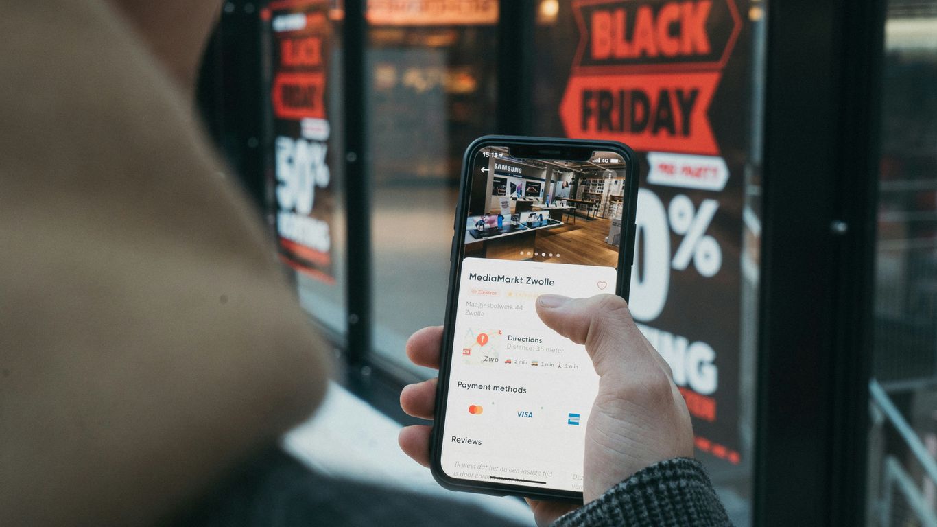
- Speed and trust matter: Your site needs to load fast, ideally in under 3 seconds. Also, show customer reviews and ratings to build confidence and encourage purchases.
Embrace The Mobile-First Ecommerce Site Design
Okay, let’s talk about how we build our online stores for phones. It’s not just about making a desktop site smaller anymore. We’ve got to flip that thinking around. We need to design for the phone first, and then figure out how to make it work on bigger screens. Think about it: most people are shopping on their phones these days, right? So, if your mobile experience is clunky or slow, you’re basically telling a huge chunk of your customers to go somewhere else.
Prioritize Essential Content and Features
When you’re designing for a small screen, there’s just no room for extra stuff. You have to be super clear about what’s most important. What’s the one thing you really want someone to do when they land on your page? That needs to be front and center. We’re talking about:
- Your main product image or offer.
- A clear "Add to Cart" or "Buy Now" button.
- Any urgent messages, like a sale ending soon.
Everything else can be tucked away or added later for larger screens. It’s all about making the core experience super smooth and easy.
Progressive Enhancement for Larger Screens
So, we’ve got our awesome, streamlined mobile design. What happens when someone visits on a tablet or a desktop? That’s where "progressive enhancement" comes in. It’s like adding layers to our mobile design. We start with that solid mobile foundation and then add more features or content as the screen size gets bigger. Maybe a desktop view can have more product details visible at once, or a sidebar with related items. It’s about making the experience better on bigger screens, not just stretching the mobile version.
Mobile Is The Main Event
Seriously, we can’t stress this enough. For a lot of businesses, mobile isn’t just a channel; it’s the channel. Projections show mobile commerce sales are going to keep climbing, making up a massive part of all online shopping. Your mobile site is your primary storefront. It’s where most of your customers are, and it’s where most of your sales will happen. If we don’t get the mobile experience right, we’re leaving money on the table. It’s that simple.
Design For The Thumb Zone
Think about how you use your phone. Chances are, you’re holding it with one hand and using your thumb to tap around. That’s where the ‘thumb zone’ comes in. It’s the area on the screen your thumb can comfortably reach without you having to shift your grip. We need to design our sites with this in mind, not for a mouse cursor.
Understand Comfortable Reach Areas
Most people naturally use their thumb to interact with their phone. This means the bottom and center parts of the screen are prime real estate. The top corners? Not so much. They’re a real stretch and can be super frustrating to hit accurately.
Here’s a quick look at what we’re talking about:
- Easy to Reach (Green Zone): The bottom and middle sections of the screen. This is where your most important buttons should live.
- Moderate Reach (Yellow Zone): Areas slightly higher or to the sides. Good for secondary actions.
- Hard to Reach (Red Zone): The top corners and far edges. Avoid putting anything critical here.
Place Key Actions Within Easy Reach
So, what does this mean for our ecommerce sites? It means putting the buttons that matter most – like ‘Add to Cart,’ ‘Checkout,’ or even your main navigation – right where thumbs naturally fall. This makes the whole shopping experience feel smoother and less like a chore. When users don’t have to strain to tap a button, they’re more likely to complete that action.
Avoid Hard-To-Reach Top Corners
We’ve all seen those websites with the menu icon or the shopping cart way up in the top corner. On a big desktop screen, that’s fine. On a phone, especially if you’re holding it one-handed, it’s a pain. We should really try to keep those important, frequently used elements in the thumb-friendly zones. It might seem like a small detail, but it makes a big difference in how easy and pleasant our site is to use.
Streamline Navigation For Mobile Users
When we’re designing for mobile, we’ve got to remember that people aren’t using a mouse. They’re using their thumbs, and they’re usually in a hurry. This means our navigation needs to be super simple and easy to get to. Trying to cram a desktop menu onto a tiny screen just doesn’t work. It’s frustrating, and people will just leave.
Simplify Complex Desktop Menus
Think about the last time you tried to find something on a mobile site with a giant, multi-level menu. It’s a pain, right? We need to cut all that clutter. For mobile, we should only show the most important links. What does the user absolutely need to see to make a purchase or find what they’re looking for? That’s what goes in the main navigation. Everything else can be tucked away or accessed through other means.
Utilize Clean Hamburger Menus
The hamburger menu (you know, the three little lines) is popular for a reason. It keeps the main screen clean while still giving users access to more options. We just need to make sure what’s inside is organized well. Don’t hide important stuff too deep. A good rule of thumb is to keep the number of main menu items to around five to seven. Any more than that, and it starts to feel overwhelming again.
Consider Bottom-Tab Bars Or Icon-Based Navigation
For apps, bottom tab bars are fantastic because they put the most used sections right under your thumb. We can borrow this idea for mobile websites too. Think about your main categories or key actions like ‘Home,’ ‘Shop,’ ‘Account,’ and ‘Cart.’ Putting these at the bottom makes them super easy to tap without having to stretch your hand. Icon-based navigation can also work if the icons are really clear and universally understood. Just make sure users know what each icon means at a glance.
Craft Compelling Calls To Action
Alright, let’s talk about getting people to actually do something on your site. We’re talking about those buttons and links that tell folks what to do next – your calls to action, or CTAs. On mobile, these need to be super clear and easy to tap.
Tailor CTAs To The User Journey
Think about where someone is when they see your CTA. Are they just browsing, or are they ready to buy? A CTA like "Shop Now" might work for someone just starting out, but if they’re looking at a specific product, you want something more direct, like "Add to Cart" or "Buy Now." We’ve found that using action-oriented words really makes a difference. Instead of a boring "Submit," try something like "Get My Discount" or "Claim My Spot." It just feels more personal and urgent.
Use Visually Distinct Buttons
Your main CTA needs to pop. Seriously. It should be the most noticeable thing on the screen. We like to use colors that stand out from the rest of the page but still fit with our brand. Think bright oranges, greens, or reds. The goal is to make it impossible to miss. It also needs to be big enough to tap easily with a thumb, so no tiny text links for important actions. We aim for buttons that are at least 48×48 pixels, which is a good rule of thumb for mobile.
Prioritize Above-The-Fold CTAs
If possible, get your main CTA visible without making people scroll. This is what we call "above the fold." When someone lands on a product page, they should see the price, key info, and the "Add to Cart" button right away. This cuts down on thinking time and makes it easier for them to decide. If you’re running a sale, make sure the CTA for that sale is front and center. We’ve seen great results from placing urgent offers near the main call to action, making it clear what the benefit is and how to get it.
We need to make it super simple for people to take the next step. If they have to hunt for the button or aren’t sure what it does, they’ll probably just leave. Clear, visible, and action-focused CTAs are key to getting more sales.
Build Trust With Social Proof
We all want to feel good about our purchases, right? Especially when we’re shopping on our phones, it’s easy to be a bit hesitant. That’s where social proof comes in. It’s basically showing potential customers that other people like them have already bought and loved your stuff. Think of it as a digital nod of approval from your peers.
Make Customer Reviews Easy to Find
This is probably the most common form of social proof, and for good reason. When people see honest reviews, it really helps them decide. We make sure our reviews are right there on the product page, usually near the price or the "Add to Cart" button. Nobody wants to hunt for opinions; they want to see them when they’re thinking about buying.
Feature Starred Ratings and Average Scores
Beyond just text reviews, those star ratings are super quick to scan. A product with a solid 4.5 stars just looks more appealing than one with a 3.2, even before you read a single word. We try to make these ratings really visible, often right in the search results or category pages, so people can get a feel for a product’s popularity at a glance.
Integrate Testimonials and Purchase Numbers
Sometimes, a short, punchy testimonial from a happy customer can be really persuasive. We also like to show off how many people have bought a particular item. Seeing something like "Over 5,000 sold!" can create a sense of popularity and urgency. It tells shoppers that this isn’t just some niche product; it’s a popular choice. It’s a subtle way to show that many others have already made the decision and are happy with it. We’ve found that showing real-time activity, like "Sarah from Chicago just bought this," can really get people moving.
Building trust isn’t just about having a good product; it’s about showing people that others trust you too. It’s a cycle: good products lead to good reviews, which lead to more sales, which lead to more good reviews. We just make it easy for that cycle to happen on our site.
Optimize For Speed And Performance
We all know that feeling, right? You tap on a link, and then you just… wait. And wait some more. It’s the worst. For online shoppers, especially on their phones, that wait can feel like an eternity. If your site is slow, people will just leave. It’s that simple.
Meet The 3-Second Load Time Expectation
Folks expect things to be fast these days. Google even says that a page should load in under 3 seconds. Honestly, even that feels a bit long sometimes. We’ve seen studies showing that even a tenth of a second faster can mean more sales. Think about it: every bit of time you shave off your load time is like finding money.
Minimize Heavy Scripts And Optimize Images
So, how do we make things zippy? First off, images. Those gorgeous product photos? They can be huge and really slow things down. We need to make sure they’re compressed and in modern formats like WebP. It makes them way smaller without looking worse. Also, watch out for too many scripts running in the background. Sometimes those fancy pop-ups or add-ons can really bog down your site. We want to load only what’s needed, and load it smartly.
Here’s a quick rundown of what helps:
- Compress Images: Use tools to make image files smaller.
- Use Modern Formats: Switch to formats like WebP.
- Lazy Load: Only load images and content when they’re about to be seen.
- Limit Scripts: Be picky about the third-party tools you add.
Understand Network Variability For Mobile Users
Remember, not everyone is browsing on super-fast Wi-Fi. Many people are on their phones, using cellular data, which can be spotty. We need to design and build our sites assuming the connection might not be perfect. Testing your site on slower network speeds is a good idea. It helps you see what your customers might be experiencing. This is where having good hosting really matters, as it provides a solid foundation for speed, no matter the connection. If you’re looking to improve your site’s speed and search engine visibility, looking into ecommerce SEO services can be a smart move.
We need to think about the whole journey. From the moment someone clicks a link to when they see your product, every second counts. Making sure your site is fast and smooth is just as important as having great products.
Ensure A Frictionless Checkout Process
Okay, so we’ve got people interested, they’ve added stuff to their cart, and now it’s time to actually get them to pay. This is where a lot of sites totally drop the ball. We’re talking about a crazy high cart abandonment rate on mobile, like 97% sometimes. That’s insane! If we can make this part easier, we’re golden.
Minimize Form Fields
Seriously, do we really need their middle name or their company name? Every single field you ask for is another reason someone might just nope out of there. We need to be super strict about this. Only ask for what’s absolutely necessary to get the order processed: name, email, shipping address, and payment info. That’s it. Keep it lean.
Offer Guest Checkout Options
Nobody wants to create an account on their phone, especially not when they’re just trying to buy one thing. Make guest checkout the default and the most obvious choice. If they want to create an account later, they can, but don’t force it on them upfront. It’s a huge conversion killer.
Integrate One-Tap Digital Wallets
This is a big one for 2026. Things like Apple Pay and Google Pay are game-changers. They let people pay with just a tap and a fingerprint or face scan. No typing in card numbers, no address entry – nothing. It’s the definition of easy. If you can add these, you’ll see a big jump in people actually finishing their purchase.
The checkout process on mobile needs to be as simple and quick as possible. Think about it: you’re on your phone, maybe you’re on the go. The last thing you want is a long, complicated form. If it’s a pain, you’re just going to leave. We need to remove every single hurdle.
Make sure buying things online is super easy for your customers. A smooth checkout means happy shoppers and more sales. Want to learn how to make your checkout process a breeze? Visit our website today for expert tips!
So, What's the Takeaway?
Look, we get it. Thinking about your website on a tiny phone screen first might seem backward. But honestly, it’s where everyone’s at these days. If your site isn’t easy to use and buy from on a phone, you’re basically leaving money on the table. We’ve talked about making things simple, putting important stuff where thumbs can reach it, and just generally making the whole process smooth. It’s not about making things look fancy; it’s about making them work for the people actually using them. So, go ahead, give your mobile site some love. Your customers, and your wallet, will thank you.
Frequently Asked Questions
Why should we focus on our mobile site first?
We gotta put our phones first because most people shop on them now! It’s like building a tiny house before a mansion – we make sure the essential stuff fits perfectly on a small screen. Then, we can add more cool features for bigger screens later. It just makes sense to build for the way most people actually shop.
What's this 'thumb zone' thing?
Think about how you hold your phone – you probably use your thumb a lot to tap buttons, right? The ‘thumb zone’ is just the comfy area your thumb can easily reach without stretching. We want to put important buttons like ‘Add to Cart’ right there so it’s super easy for people to click.
How can we make our website easier to use on a phone?
We need to ditch those super complicated menus from desktop sites. Instead, we can use a simple ‘hamburger’ menu (those three lines!), or maybe a bar at the bottom with icons people can tap. The goal is to make finding stuff quick and easy, not a treasure hunt.
What makes a 'call to action' button work well on mobile?
A good button is like a clear signpost. We want it to be bright and stand out, maybe a different color than everything else. It should also tell people exactly what to do, like ‘Shop Now’ or ‘Buy It.’ Plus, it needs to be easy to see right away, without scrolling too much.
How do we make people trust our mobile site?
People love to see what others think! We should make it super easy for customers to leave reviews and show off their star ratings. Seeing that other people like and buy our stuff builds trust. We can even show how many people have bought something recently – that’s pretty convincing!
Why is website speed so important for mobile shoppers?
Nobody likes waiting around! On phones, especially when people are out and about, they expect things to load super fast, like in 3 seconds or less. If our site is slow, people will just leave and go somewhere else. Making our site quick is a huge part of making people happy and getting them to buy.
Related services from Digital Marketing Singapore: SEO, SEM, Social Media Marketing, Content Marketing, Website Design. See how these principles come together in our real work — browse our portfolio of Singapore websites →
Natasha Tan is the founder of Digital Marketing Singapore, a full-service SEO and digital marketing agency based in Singapore. With hands-on experience across SEO, paid media, and content strategy, she works directly with Singapore businesses to build organic visibility and generate consistent leads. Natasha specialises in the Singapore market — including local search behaviour, PDPA compliance, and government grant navigation for SMEs.