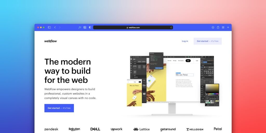
Most Singapore business owners assume a website converts visitors because it looks professional. That assumption is actually wrong. A polished, modern-looking site with a slow load time, a buried contact form, and no clear next step converts worse than a plainer site that makes the path to enquiry obvious. In our experience, the businesses that consistently turn website traffic into leads are not the ones with the most expensive web design, they are the ones that treat every page as a tool built to move a specific visitor toward a specific action.

This guide sets out exactly what a Singapore business website needs to convert visitors, based on what we have measured across the sites we build and audit rather than generic design trends.
The Website Elements That Actually Move Conversion
| Element | Why It Matters | Common Failure |
|---|---|---|
| Page speed | Visitors abandon slow pages before they even see your offer | Unoptimised images, bloated plugins |
| Above-the-fold clarity | Visitors decide to stay or leave within seconds | Vague headline, no clear value proposition |
| Call to action placement | A hidden CTA never gets clicked | Buried at the bottom, unclear wording |
| Trust signals | Reduces hesitation for first-time visitors | No reviews, testimonials, or credentials shown |
| Mobile experience | Most Singapore traffic now arrives on a phone | Desktop-first design ported poorly to mobile |
Priority One: Speed Is the First Conversion Barrier
Before a visitor reads a single word of your copy, your website has already made its first impression through how fast it loads. A slow site does not just rank worse in search, it actively loses visitors before they see your offer at all. We typically see bounce rates drop noticeably once load time improves from the four to five second range down to under two seconds, simply because fewer visitors leave before the page finishes rendering.
Website speed optimisation is one of the highest-return investments available for an existing site, because it improves every other conversion element by ensuring visitors actually stay long enough to see them.
Priority Two: Say What You Do in Five Seconds
A visitor who lands on your homepage should understand what you do, who you do it for, and why they should care, all within about five seconds. Most business websites fail this test not because the writing is bad, but because it is written from the business's perspective rather than the visitor's", describing the company rather than the outcome the visitor is looking for.
We generally recommend a headline that names the specific outcome or problem solved, a supporting line that names who it is for, and a single clear next step, rather than a broad mission statement that could describe almost any company in the industry.
Priority Three: Make the Next Step Obvious and Singular
Every page on a converting website has one primary action it wants the visitor to take, whether that is calling, filling a form, or booking a consultation. Websites that offer five different calls to action on a single page, "call us," "email us," "download our brochure," "follow us on social," "chat with us," end up diluting all of them, because the visitor has to decide which action matters most instead of the website deciding for them.
A well-structured landing page makes this decision for the visitor by featuring one primary call to action prominently, with secondary options available but visually de-emphasised.
Priority Four: Build Trust Before You Ask for Contact Details
Contrary to how many business websites are structured, asking for contact information before establishing any trust is one of the most common conversion killers we see. Visitors who do not yet trust a business are unlikely to hand over their phone number or email, no matter how good the offer sounds. Testimonials, client logos, case studies, and specific credentials placed before the contact form do far more conversion work than the form itself.
One client we worked with, a corporate services firm, added three short client testimonials directly above their contact form on their main service page, replacing a generic paragraph about company values. Form submissions from that page increased within the following month, without any change to traffic volume, purely because visitors had a reason to trust the business before being asked to commit contact details.
Where Singapore Business Websites Waste Conversion Potential
Across the sites we audit, a handful of recurring mistakes account for most of the lost conversion opportunity, regardless of industry.
Burying the contact information. A phone number or contact form that requires scrolling through several sections to find loses visitors who are ready to act right now but cannot locate a way to do it.
Overloading the homepage. Trying to say everything about the business on one page, every service, every credential, every award, leaves visitors with no clear sense of what to do next, when a focused homepage with clear paths to relevant sub-pages converts far better.
Ignoring the mobile experience. A site designed and tested only on desktop often breaks down on mobile: text too small to read, buttons too close together to tap accurately, forms that are painful to complete on a small screen.
Using stock photography that adds nothing. Generic images of people shaking hands or looking at laptops do not build trust the way a real photo of the actual team, office, or product does, and can make a business feel less authentic rather than more professional.
Skipping analytics entirely. Without conversion tracking in place, a business cannot tell which pages are actually working and which are quietly leaking visitors, which means design decisions get made on instinct rather than evidence.
Treating the website as finished after launch. A site built once and never revisited slowly drifts out of step with the business, missing new services, outdated pricing, and design patterns that looked current at launch but feel dated a few years later.
How Conversion Priorities Shift by Industry
A service business selling a considered purchase, such as legal or financial advisory services, converts best with a website heavy on trust signals: credentials, case studies, and detailed service explanations that support a visitor doing careful research before making contact. A retail or e-commerce site selling a lower-consideration purchase converts best with fast-loading product pages, clear pricing, and a frictionless checkout process, since speed and simplicity matter more than exhaustive explanation. A local service business, such as a clinic or a repair service, converts best with an unmistakably clear location, hours, and contact method above the fold, since most visitors arriving on that kind of site already know roughly what they want and just need a fast way to act.
A Real Example: A Redesign That Focused on Conversion, Not Just Looks
One client came to us with a website that had been redesigned eighteen months earlier by another agency, purely for visual refresh. It looked considerably more modern than their old site, but enquiries had not improved at all. We audited the site and found the new design had actually made several conversion elements worse: the contact form had moved further down the page, the primary call to action competed with three other equally prominent buttons, and page load time had increased due to unoptimised new imagery.
Rather than a full visual overhaul, we made targeted changes: compressed and properly sized all images, moved the contact form and call to action above the fold, removed two of the four competing calls to action, and added three specific client testimonials near the top of the page. The visual style barely changed. Enquiries from the same traffic volume increased substantially within the following six weeks. The lesson was that the previous redesign had optimised for looking modern rather than for actually converting visitors, and those two goals are not automatically the same thing.
Building Trust Signals That Actually Work in Singapore
Generic trust badges and stock testimonial quotes do less work than specific, verifiable signals. A named client with their company logo, a specific measurable result, or a visible certification relevant to your industry all convert better than vague claims like "trusted by hundreds of businesses." Singapore audiences in particular respond well to locally recognisable signals: a listing on a known local business directory, a recognisable local client, or a specific Singapore-based case study, since these feel more immediately credible than generic global claims.
Designing for the Way Singapore Visitors Actually Browse
Mobile traffic makes up the large majority of visits for most Singapore business websites, and mobile visitors behave differently from desktop visitors. They scroll faster, they are less patient with slow-loading pages, and they are far more likely to abandon a form that requires excessive typing. A mobile-first approach to layout, with large tap targets, minimal required form fields, and a sticky call-to-action bar, converts noticeably better than a desktop design simply scaled down to fit a smaller screen.
Frequently Asked Questions
How much does a conversion-focused website redesign typically cost in Singapore? Costs vary widely depending on scope, from a few thousand dollars for a focused landing page rebuild to a much larger investment for a full multi-page site. The bigger factor in return is whether the redesign specifically targets conversion elements rather than visual style alone.
Should I redesign my whole site or fix specific pages first? Fixing specific high-traffic pages first, particularly your homepage and primary service pages, usually produces faster, more measurable results than a full site overhaul, and lets you validate what is working before committing to a larger project.
How do I know if my website is actually converting well? Track form submissions, calls, and enquiries by source in Google Analytics, not just traffic. A site with strong traffic and a very low enquiry rate almost always has a conversion problem rather than a visibility problem.
What is the single most overlooked conversion element? Page speed. Businesses spend heavily on design and copy while leaving a slow-loading site to quietly lose visitors before any of that work is ever seen, which is the core argument of this guide.
Field Notes
Across the sites we have redesigned specifically for conversion rather than visual refresh, businesses typically see enquiry rates improve within 6 to 8 weeks of launch, without a corresponding increase in traffic. That timeframe is a reasonable benchmark if you are testing whether a website change is working: look for movement in enquiries within that window before concluding the redesign did or did not help.
Website Maintenance as an Ongoing Conversion Investment
Website maintenance is often treated as a technical afterthought, but it directly protects conversion rate over time. Broken links, outdated pricing, expired promotions still showing on the homepage, and slowly degrading page speed as plugins accumulate all quietly erode the same conversion elements a business paid to build in the first place. A quarterly review of core conversion pages, checking load time, broken forms, and outdated content, catches this kind of decay before it meaningfully affects enquiry volume.
E-commerce Sites Have Their Own Conversion Rules
An e-commerce website converts on a different set of priorities than a service business site. Product page clarity, checkout friction, and payment method variety matter more than the trust-building content that dominates service sites, since the purchase decision is often smaller and more impulsive. Removing unnecessary checkout steps, offering popular local payment methods, and showing clear delivery timelines tend to produce faster, more measurable conversion improvements than broader brand messaging changes for this category of site.
UI and UX Decisions That Quietly Affect Conversion
Beyond copy and structure, small UI and UX design decisions accumulate into a meaningfully better or worse conversion rate. Consistent button styling that clearly signals what is clickable, adequate white space that prevents pages from feeling cluttered, and a visual hierarchy that guides the eye toward the primary action all matter more than most business owners initially expect. These elements rarely get attention in a rushed redesign, yet they are frequently what separates a page that converts well from one that merely looks acceptable.
Signs Your Website Has a Conversion Problem, Not a Traffic Problem
Businesses often respond to disappointing enquiry numbers by investing further in traffic generation, more advertising, more content, more SEO, when the actual issue sits on the website itself. A few signals reliably point to a conversion problem rather than a traffic problem: your analytics show healthy or growing sessions but flat or declining form submissions, your bounce rate is unusually high on pages that should be relevant to the visitor's search, visitors spend very little time on key pages before leaving, or your sales team reports that leads arriving through the website are lower quality than leads from other channels. When two or more of these signals are present, additional traffic spend without first fixing the website is unlikely to move the needle, since it is simply sending more visitors into the same leaking funnel.
Diagnosing this correctly matters because the fix is usually far cheaper than the traffic spend it saves. A month of additional advertising spend to compensate for a poorly converting page frequently costs more than the one-time cost of actually fixing that page, and the fix keeps paying back on every visitor after that, not just the ones from a single campaign.
Forms: The Most Underrated Conversion Lever
The contact form itself is one of the most overlooked conversion elements on a business website. Every additional field on a form reduces the number of people who complete it, yet many Singapore business websites ask for far more information upfront than they actually need to start a conversation: full address, company size, budget range, and multiple phone numbers, before a visitor has even had a first conversation with the business. Reducing a form to the minimum fields genuinely needed for a first response, typically name, contact method, and a brief note on what they need, consistently increases completion rates without reducing the quality of leads received, since the additional qualifying information can be gathered in the first conversation instead.
Error handling matters just as much as field count. A form that fails silently, or that clears all previously entered information when one field is filled incorrectly, frustrates visitors enough that many simply give up rather than retry. Clear, specific error messages that preserve the visitor's other entries remove one of the most common sources of quiet, invisible conversion loss on an otherwise well-designed page.
Keeping a Converting Website Working Over Time
A website that converts well today will not necessarily convert as well in a year without attention. Competitor sites improve, visitor expectations shift, and small technical issues accumulate quietly in the background. Reviewing your core conversion pages every quarter, checking load time, form functionality, and whether your calls to action still reflect your current offers, keeps a working website from slowly losing its edge. If your site is generating traffic but not enquiries, an SEO consultant review paired with a conversion audit can usually pinpoint exactly where visitors are dropping off. You can see real examples of this kind of work in our case studies, or get in touch for a review of how your current website could convert more of the traffic it already receives.

Natasha Tan is the founder of Digital Marketing Singapore, a full-service SEO and digital marketing agency based in Singapore. With hands-on experience across SEO, paid media, and content strategy, she works directly with Singapore businesses to build organic visibility and generate consistent leads. Natasha specialises in the Singapore market — including local search behaviour, PDPA compliance, and government grant navigation for SMEs.